

UI/UX Design · Product Design · Web & Mobile
The Brief
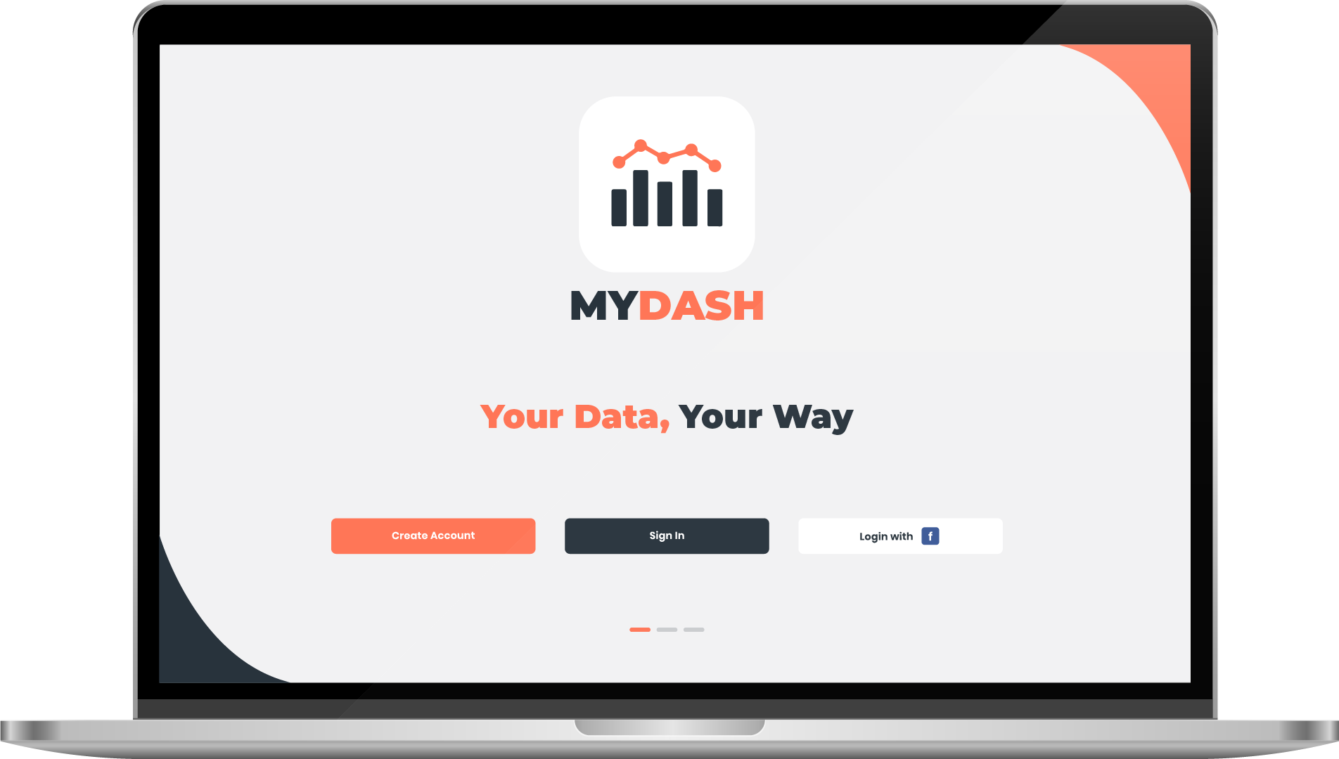
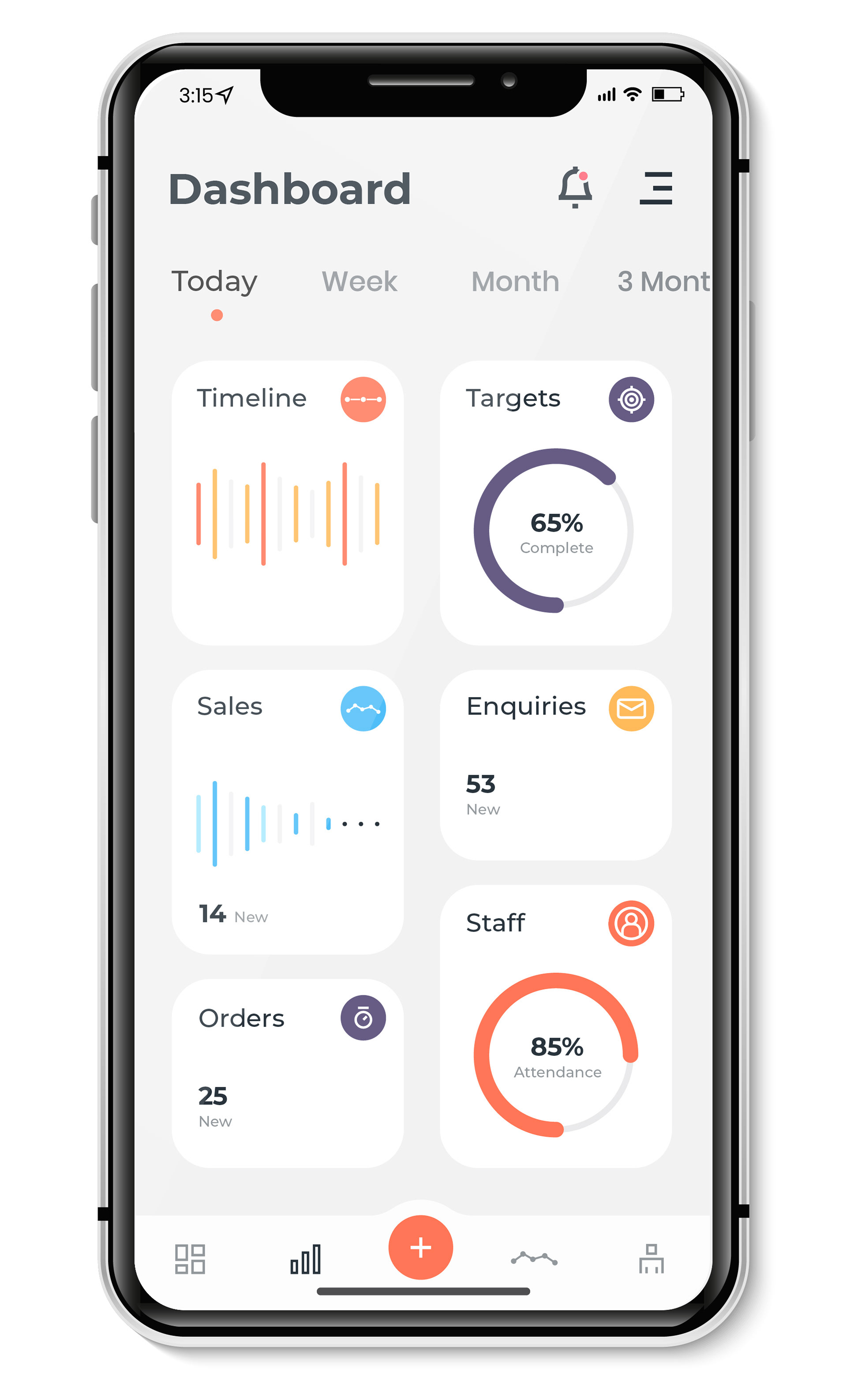
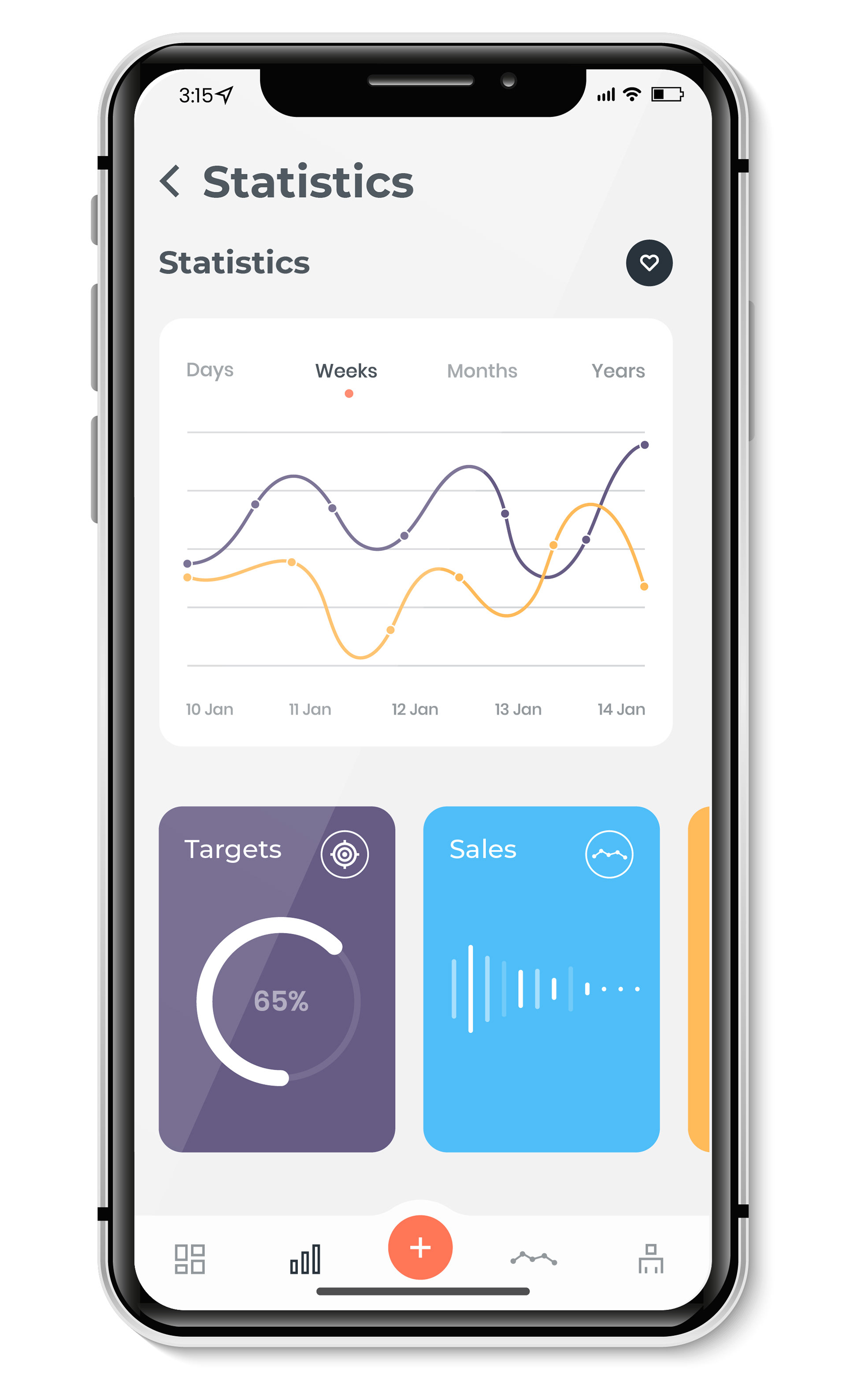
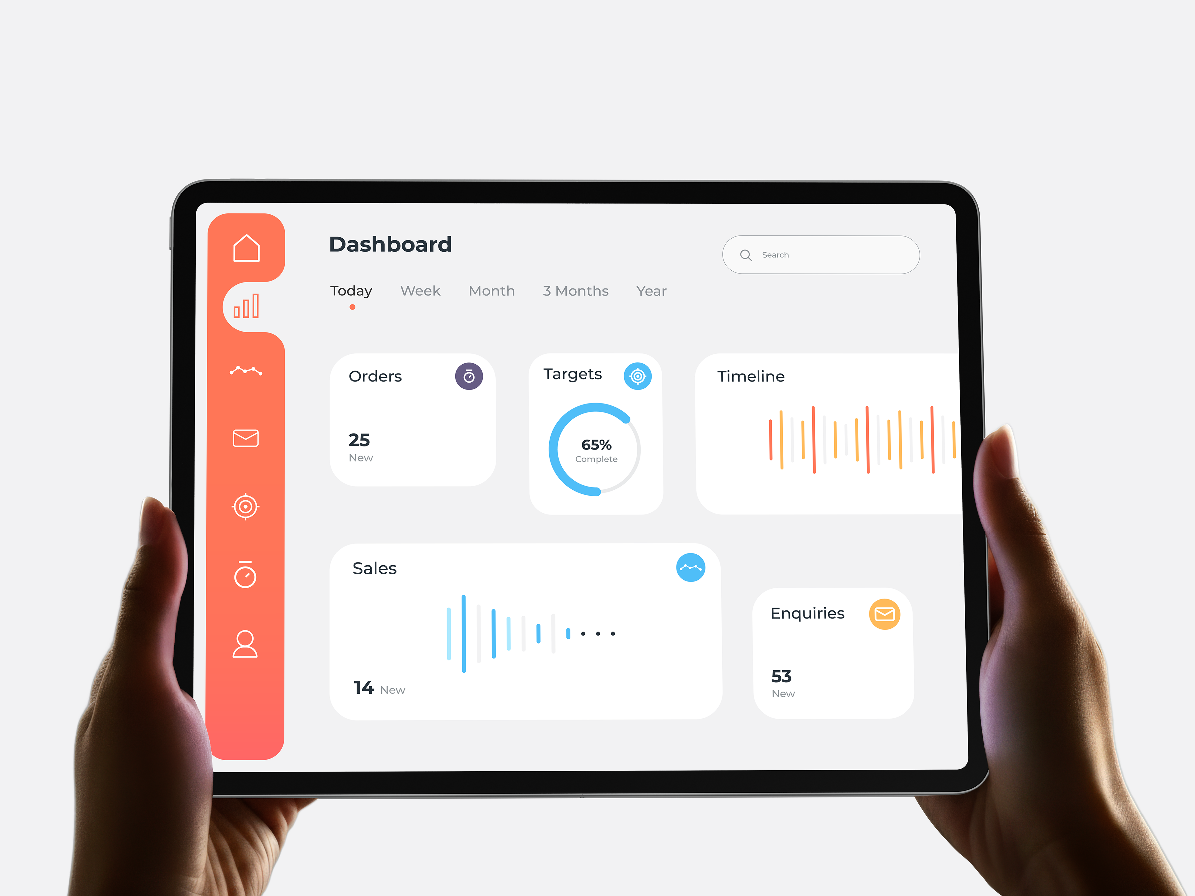
As an in-house product designer, I was tasked with designing MyDash - an analytics dashboard for business owners and professionals to track performance metrics across web and mobile. The brief called for a modern, data-dense interface that stayed clean and scannable at a glance, with a quick turnaround from concept to final screens.
The Approach
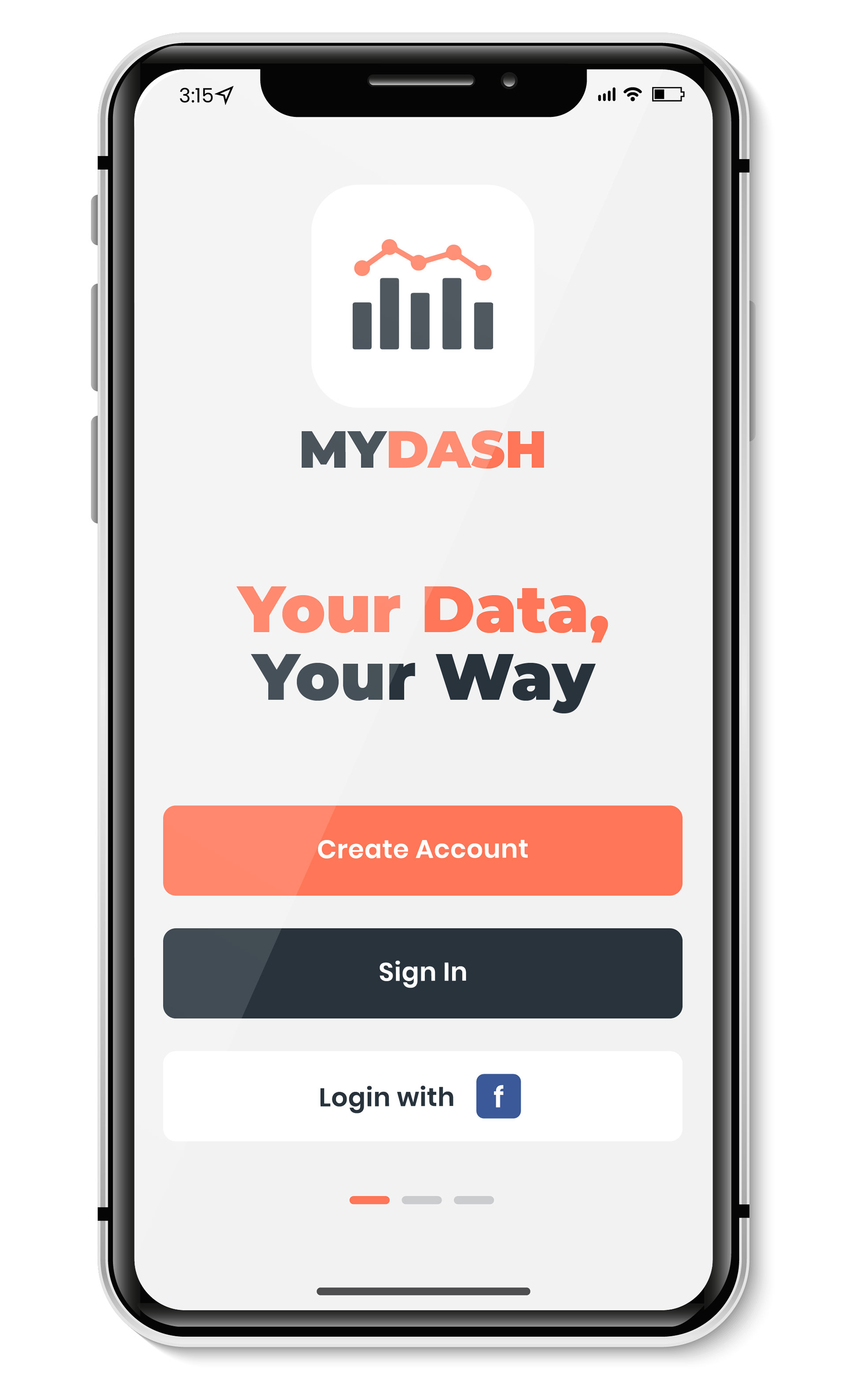
I focused on building an interface that could handle dense analytics data without feeling cluttered - using clear visual hierarchy, generous whitespace, and a restrained colour palette to let the data itself stand out. Alongside the UI, I also developed the tagline "Your Data, Your Way" to anchor the brand's positioning around flexibility and user control - carrying that same premium, trustworthy tone through into the login and splash experience. Designing consistently across web and mobile meant establishing a component system early, so the dashboard's charts, cards, and navigation patterns could scale between breakpoints without compromising usability.
The Deliverables
- Splash screen design
- Login page (web + mobile)
- Main dashboard (web + mobile)
- Component/UI system for scaling across breakpoints
The Outcome
The final designs were extremely well received internally, with a lot of positive feedback across the team. The MyDash App is currently in development, with the mobile build underway - and the project's success led to further product design work with the same team.