
Brand Identity · Digital Design · Print · Web
The Brief
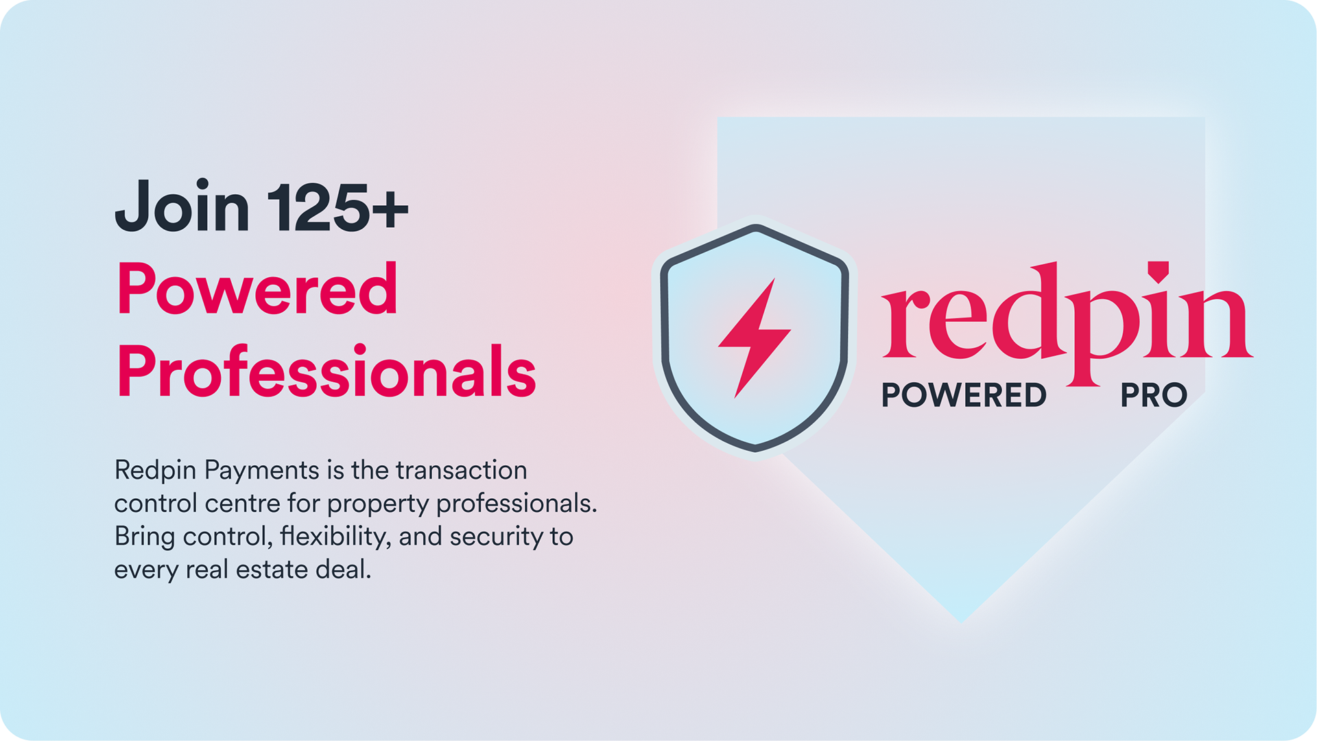
Redpin is a regulated fintech platform used by legal and property professionals across Spain and Portugal to manage cross-border transactions securely. With over 300 professionals in the network and €10b+ exchanged annually, Redpin needed a way to visually recognise and celebrate the professionals who use the platform - reinforcing trust and credibility both for existing users and prospective ones evaluating the network.
The brief was to create a distinctive, premium badge system - a recognisable trust mark that could work across the Success Stories web page, partner marketing assets, email, print, and digital applications at any scale. The badge needed to feel authoritative, unmistakably Redpin, and robust enough to evolve into a tiered programme over time.
The Approach
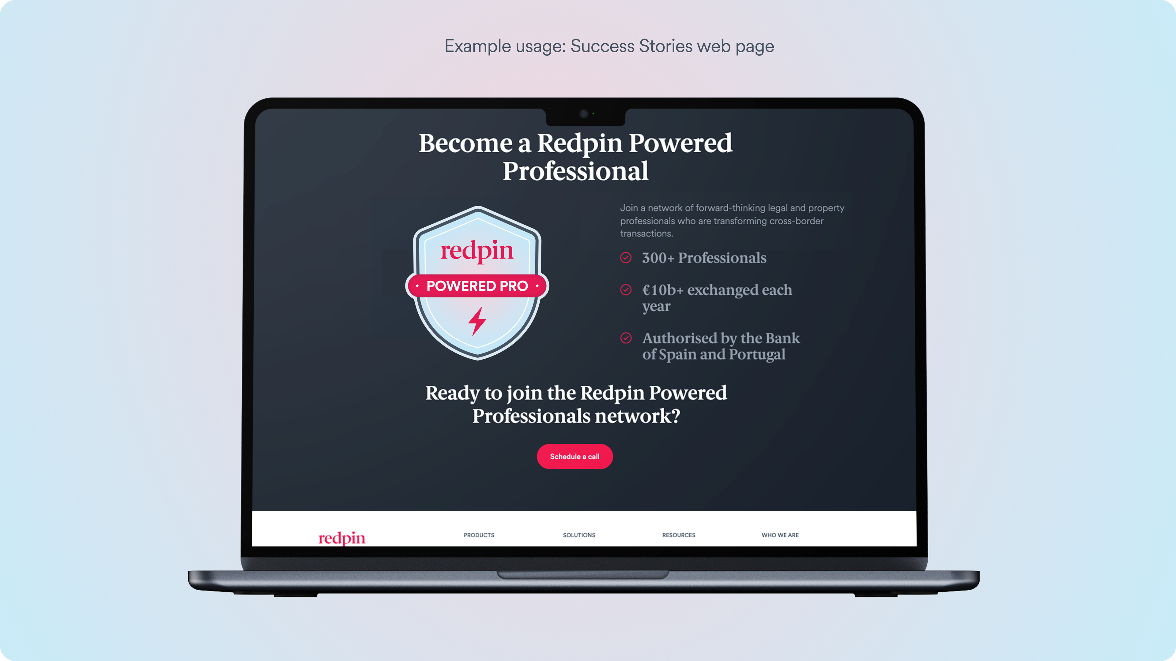
The Redpin Powered Professional badge was designed entirely from scratch. The starting point was the idea of professional accreditation - the kind of trust signal that immediately communicates verified status, the way a kitemark or certification badge does in other industries. That pointed toward a shield as the natural base form: instantly legible as a mark of credibility, with enough structure to carry the Redpin brand clearly at any size.
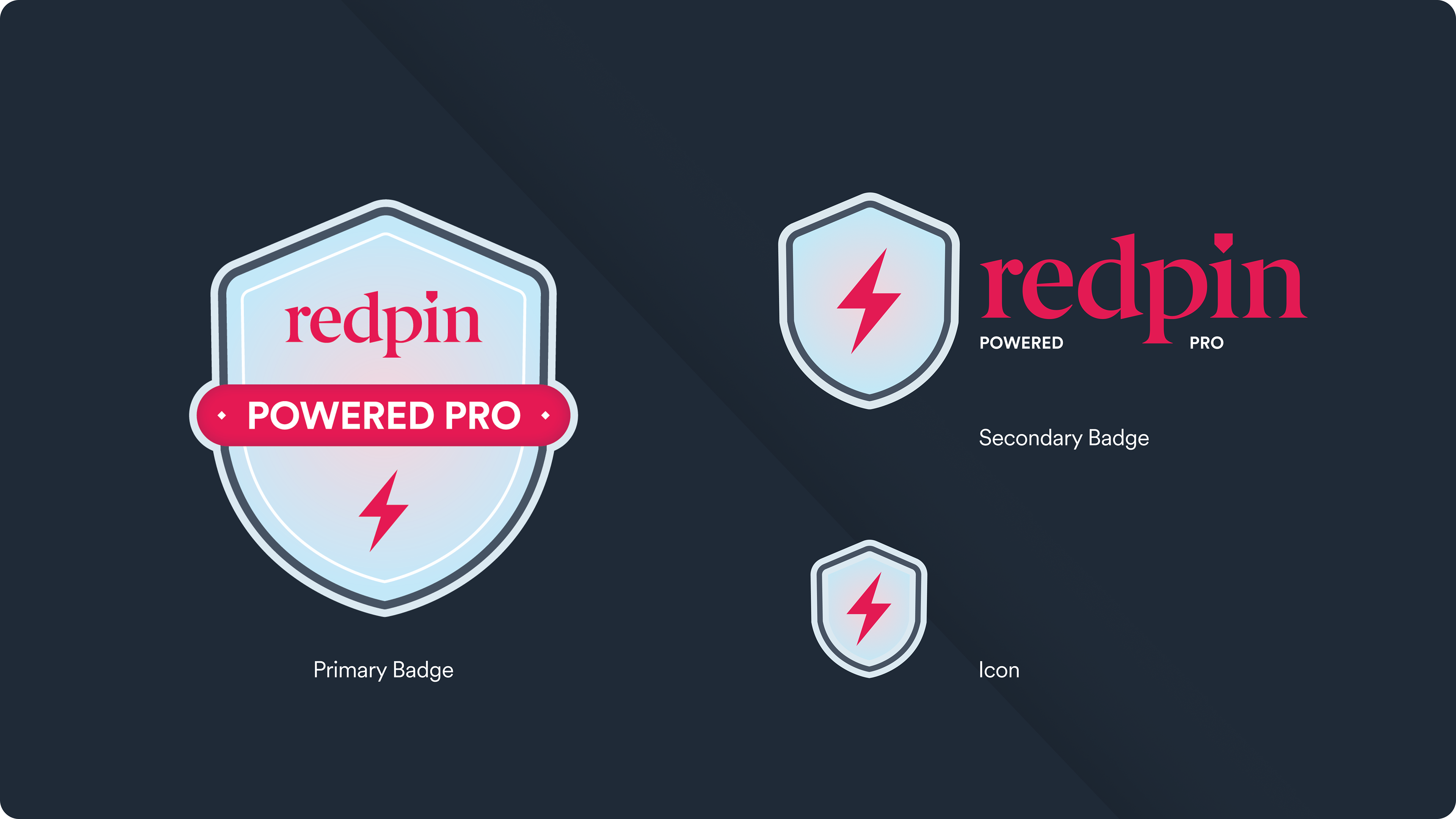
The shield was developed with Redpin's brand language throughout - the wordmark centred, the brand red used for the banner detail. At the heart of the mark sits a lightning bolt - chosen deliberately. It signals energy, speed, and power, reflecting what Redpin actually delivers for its professional network: faster transactions, instant payments, and a decisive edge in cross-border property deals. It also carries a sense of activation - being a Redpin Powered Professional isn't a passive status, it's an advantage.
Scalability was a core constraint from the outset. The badge needed to read clearly as a large hero element on a web page, as a mid-size asset in an email, and as a micro icon in navigation and app interfaces. A three-tier system was developed to address this - primary badge for high-visibility marketing and print applications, a secondary simplified lockup for partner pages and co-branding, and a micro icon for ultra-small placements.
The Deliverables
- Primary badge (Tier 1) - full shield design for marketing, print, and high-visibility digital use
- Secondary lockup (Tier 2) - simplified shield and wordmark combination for digital advertising, partner pages, co-branding, and profile applications
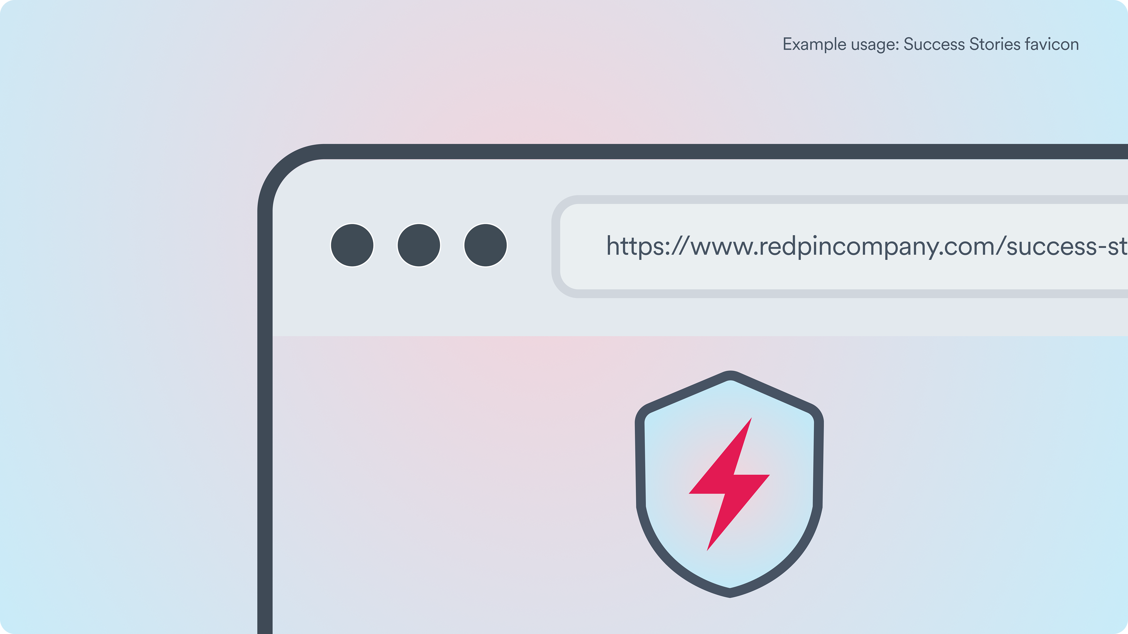
- Micro icon (Tier 3) - minimal version for navigation, app interfaces, favicons, and ultra-small placements
- Usage across the Redpin Success Stories web page and campaign pieces
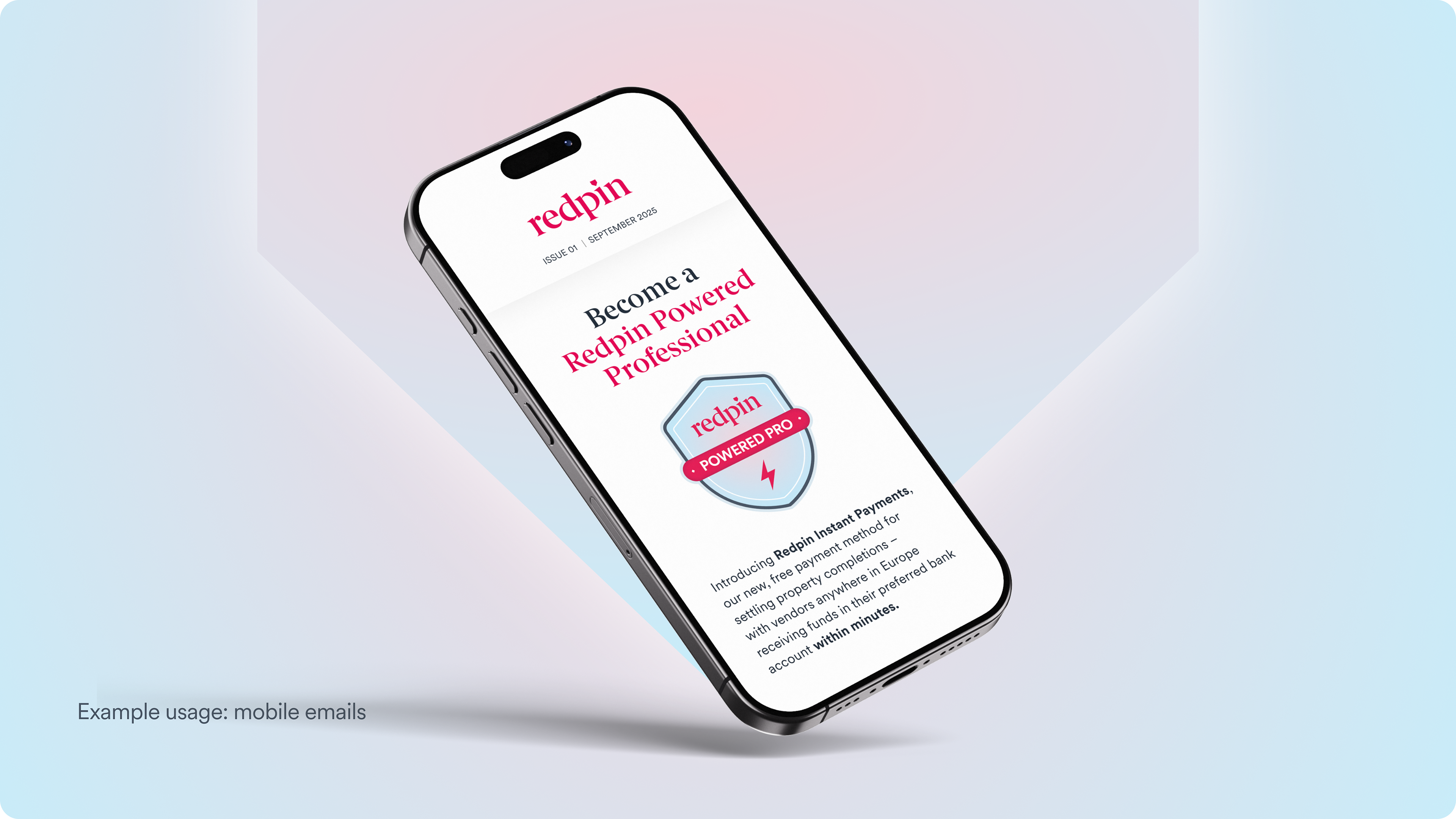
- Usage in email campaigns sent to hundreds of professionals
- Supporting assets for printed collateral and partner marketing
The Outcome
The badge launched alongside Redpin's Success Stories campaign and is now live on the website, used as the central trust mark for the Redpin Powered Professional network. It has been deployed across web, email, and print - giving the programme a consistent, premium visual identity that had not previously existed. Internally, the badge was recognised as successfully aligning with Redpin's brand language while clearly signalling professional credibility - helping reposition Redpin as a trusted professional ecosystem rather than simply a payments platform.