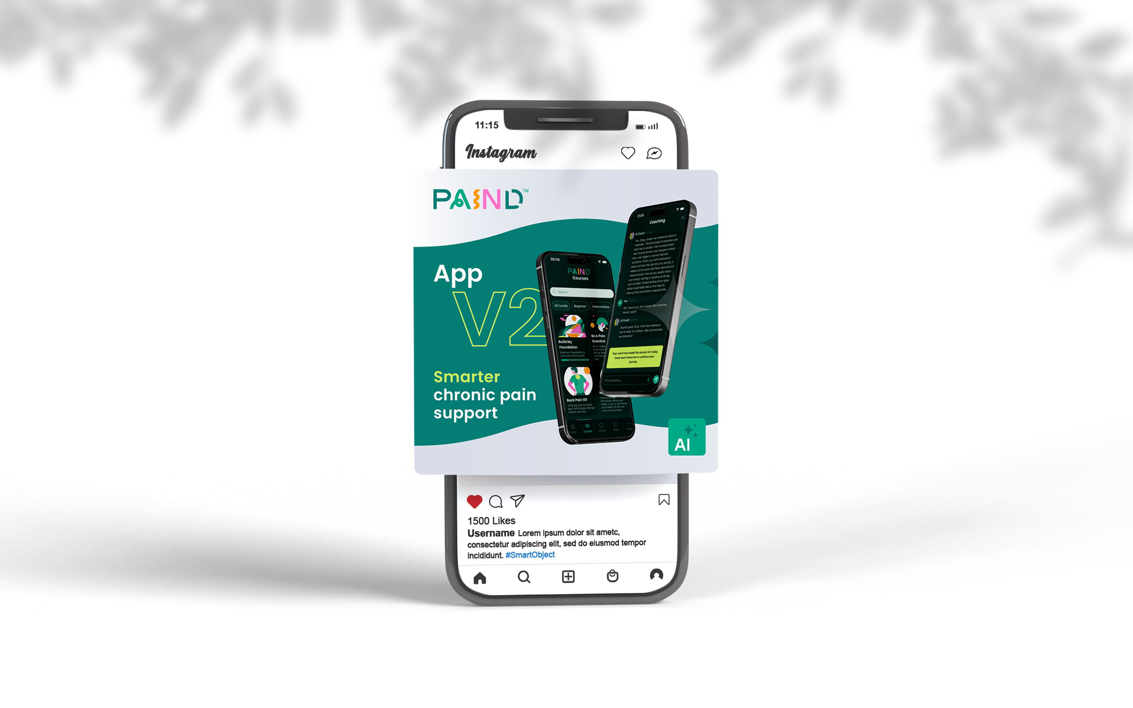

Digital Marketing · Email Design · Landing Page · App Store Graphics
The Brief
PAIND is an AI-powered chronic pain management app, offering expert-led courses, AI coaching, and moderated support groups for people living with conditions like fibromyalgia, back pain, and other long-term health issues. Recommended by NHS physiotherapists and pain clinics across the UK, the app was rebuilt from the ground up for its v2 launch — a significant upgrade introducing paid subscriptions, offline course access, AI coaching, and a completely redesigned experience.
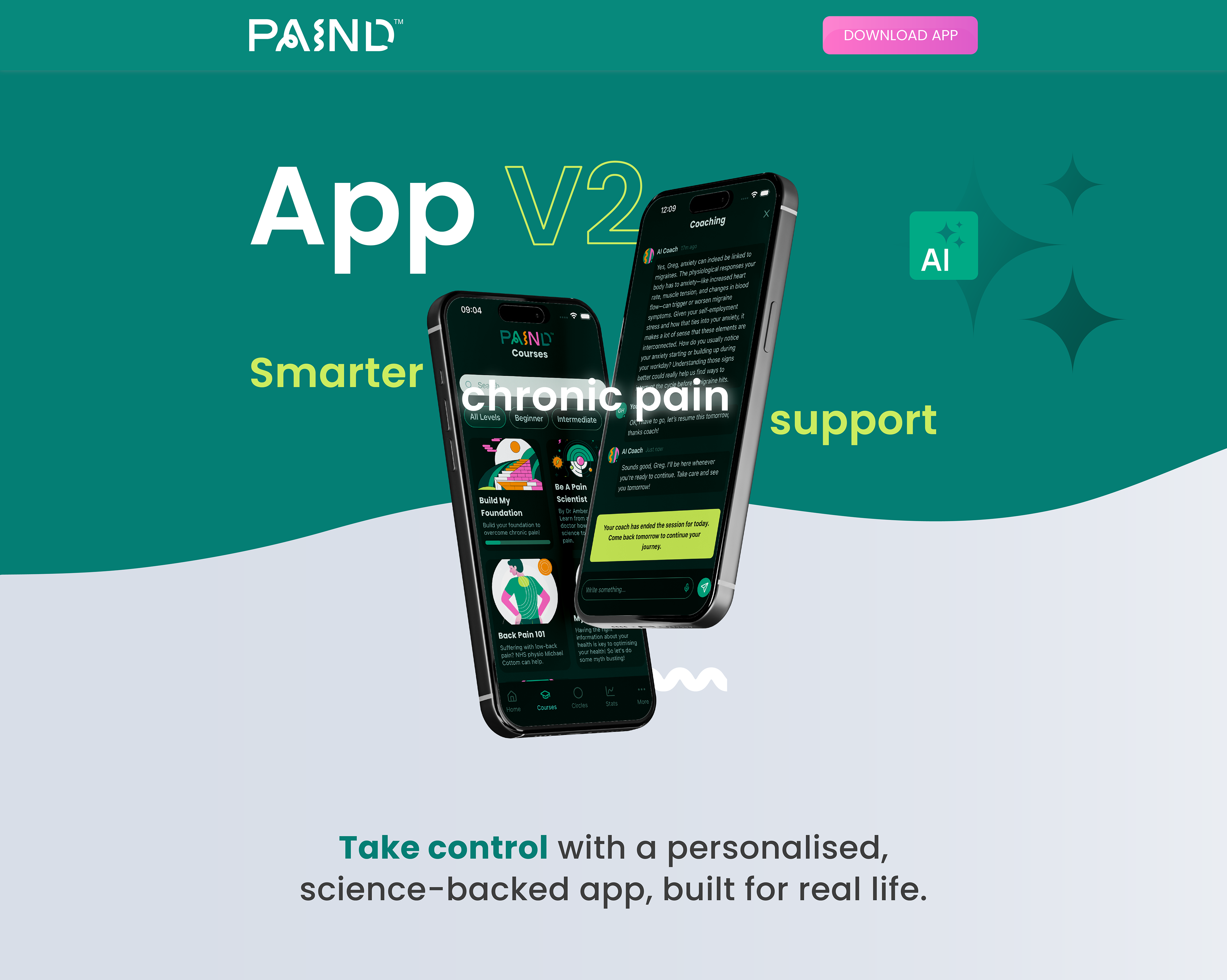
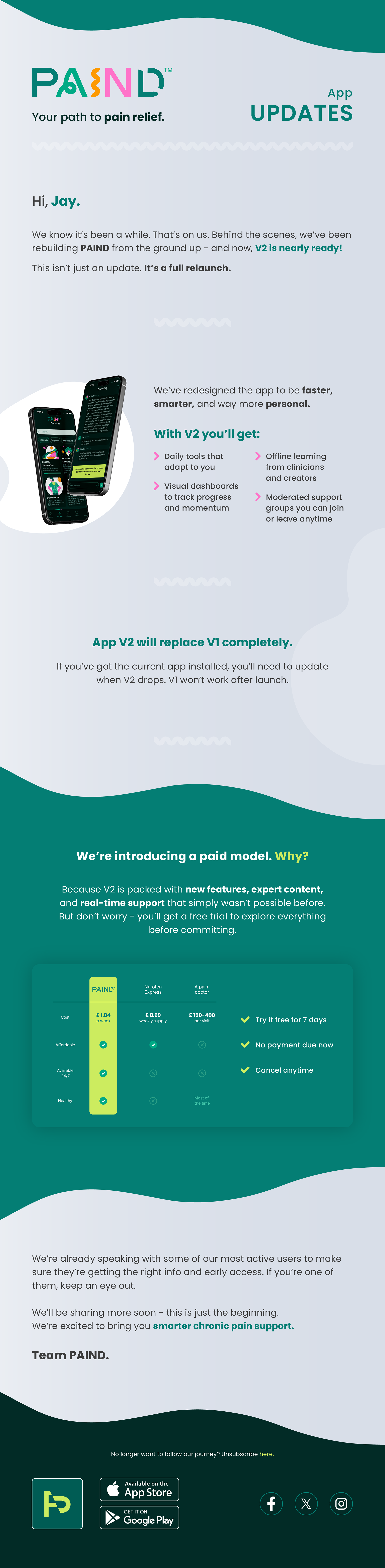
What began as a single email template commission quickly grew into a full launch campaign. The team were so pleased with the initial work that they brought me on for the entire v2 rollout — landing page, app store graphics, social media assets, and ongoing design support across the launch.
The Approach
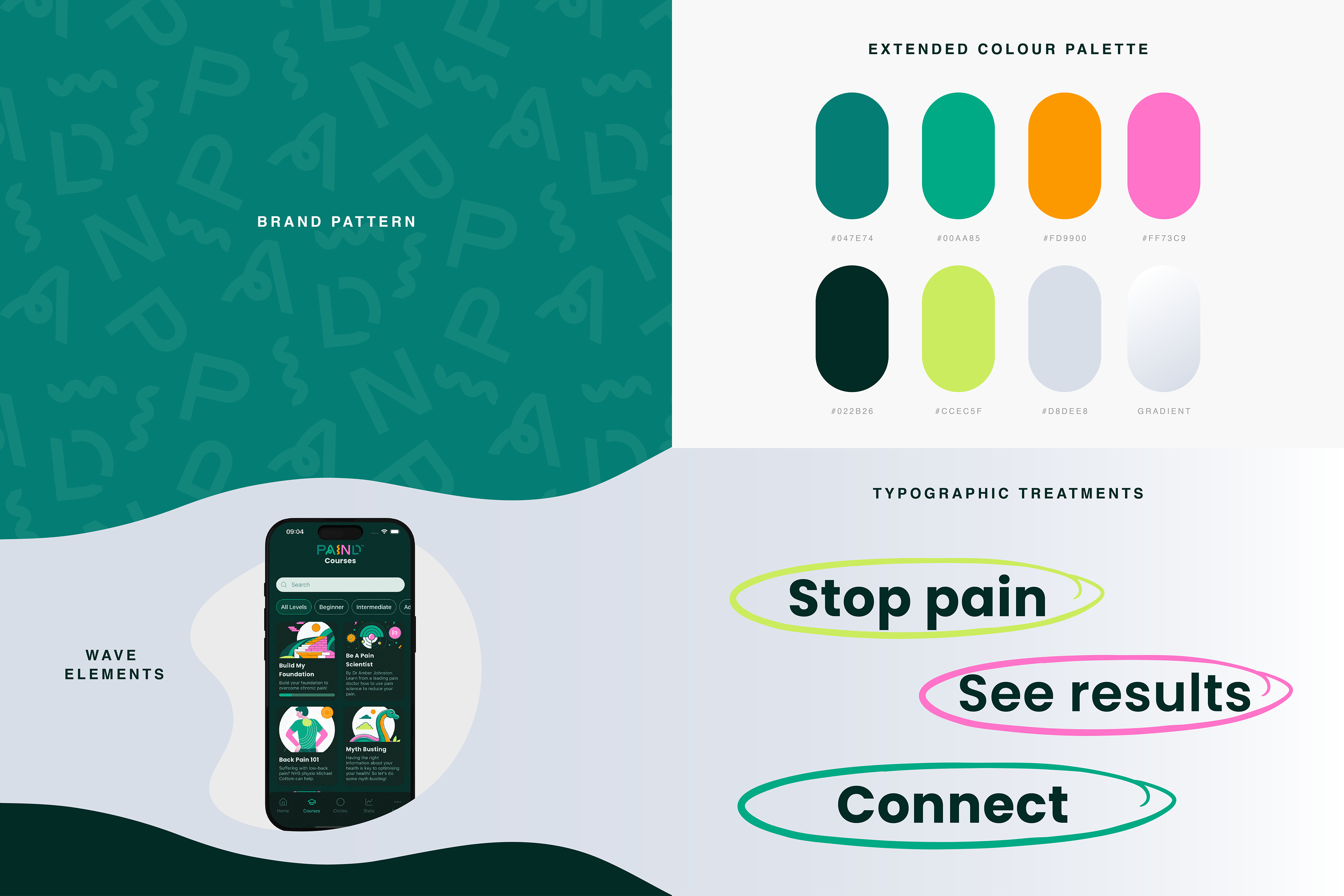
PAIND came to me with a basic brand kit — a logo, a limited colour palette, and a set of illustrations. Everything else was designed from scratch. The wave and curve styling, the background pattern, the typographic treatment, the oval headline highlights, the layout system across every format — all originated with me, developed to work cohesively across landing page, email, app store, and social in a way the brand hadn't had before.
The palette gave me primary and secondary greens as a starting point, but the existing brand leaned too heavily on a single dark tone. I introduced additional colour combinations and created more breathing room, giving the visual system the range it needed to work across light and dark backgrounds without feeling monotonous.
The curved styling became the connective tissue across every touchpoint. It felt like it captured a sense of flow - perfect for a brand built around a very personal health journey.
The most considered decision was the background pattern. Rather than use a generic texture, I built it by taking elements of the PAIND logo and scattering them across the canvas — rotated, jumbled, layered. On the surface it reads as a branded texture. But the intention was deliberate: people living with chronic pain often describe feeling lost, overwhelmed, and unsure where to turn. The disorganised logo fragments quietly reflect that experience, giving the brand a layer of meaning that its audience would feel even if they couldn't articulate why.
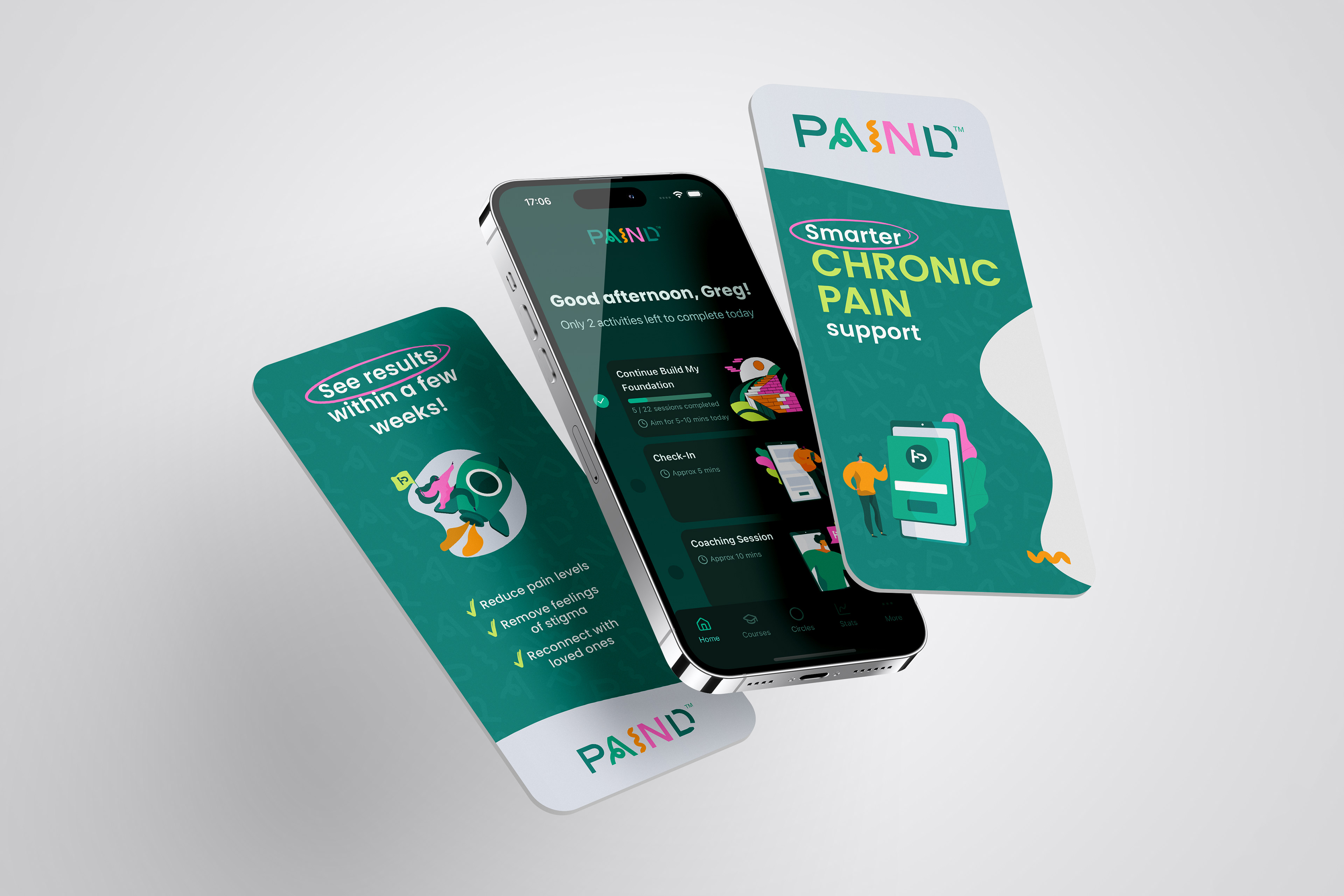
The app store image suite was designed as a sequential carousel — each image leading into the next — with bold benefit-led headlines, a consistent oval highlight treatment, and a mix of real app UI and PAIND's illustration library. I wrote the landing page copy, drawing on their website and internal product documentation, then refined it with the founders. The email template was designed in Figma and handed to their development team to build, with me reviewing and providing feedback during the implementation.
The Deliverables
- Website landing page design and copywriting for the app v2 launch
- App store image suite - 7-image carousel (Google Play & IOS App Store)
- Email templates - designed in Figma from scratch, coded by their dev team
- Social media assets - profile images, cover images, and ad graphics (Facebook, YouTube, Twitter/X)
The Outcome
The v2 launch campaign marked a significant step change for PAIND - from a free, early-stage product to a fully monetised app with a paid subscription model and a proper marketing presence to match. Every deliverable was met with strong positive feedback from both founders and the team, with the app store suite and email template drawing particular praise. The wave-and-curve design language and background pattern system were adopted consistently across the launch, giving PAIND a much more cohesive and considered visual identity than it had previously had.