

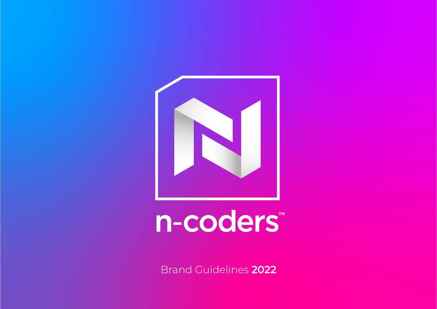
Brand Identity · Brand Guidelines · Print · Social Media
The Brief
n-coders are a Cornwall-based software and game development company specialising in immersive XR technologies — building VR and AR applications, gamification systems, embedded software, and bespoke digital experiences for clients across the UK and beyond. Despite the sophistication of their work, their brand had fallen badly behind. It was dated, generic, and failing to communicate the ambition of a company pushing the boundaries of immersive technology. They came to me for a full rebrand: new identity, business collateral, social media graphics, and a comprehensive set of brand guidelines built from scratch.
The Approach
Before putting pen to paper, I audited the competitive landscape. What I found was immediately telling — almost every local software developer was using the same muted, corporate blue as their primary colour, with logos so interchangeable they offered no differentiation whatsoever. For a company building virtual worlds and immersive experiences, blending into that crowd would have been a missed opportunity. The colour direction followed naturally from that gap. Rather than play it safe, I built the palette around bright, vibrant tones — bold enough to signal energy and innovation, and distinctive enough to be genuinely memorable. The new brand would stand out before a word was read.
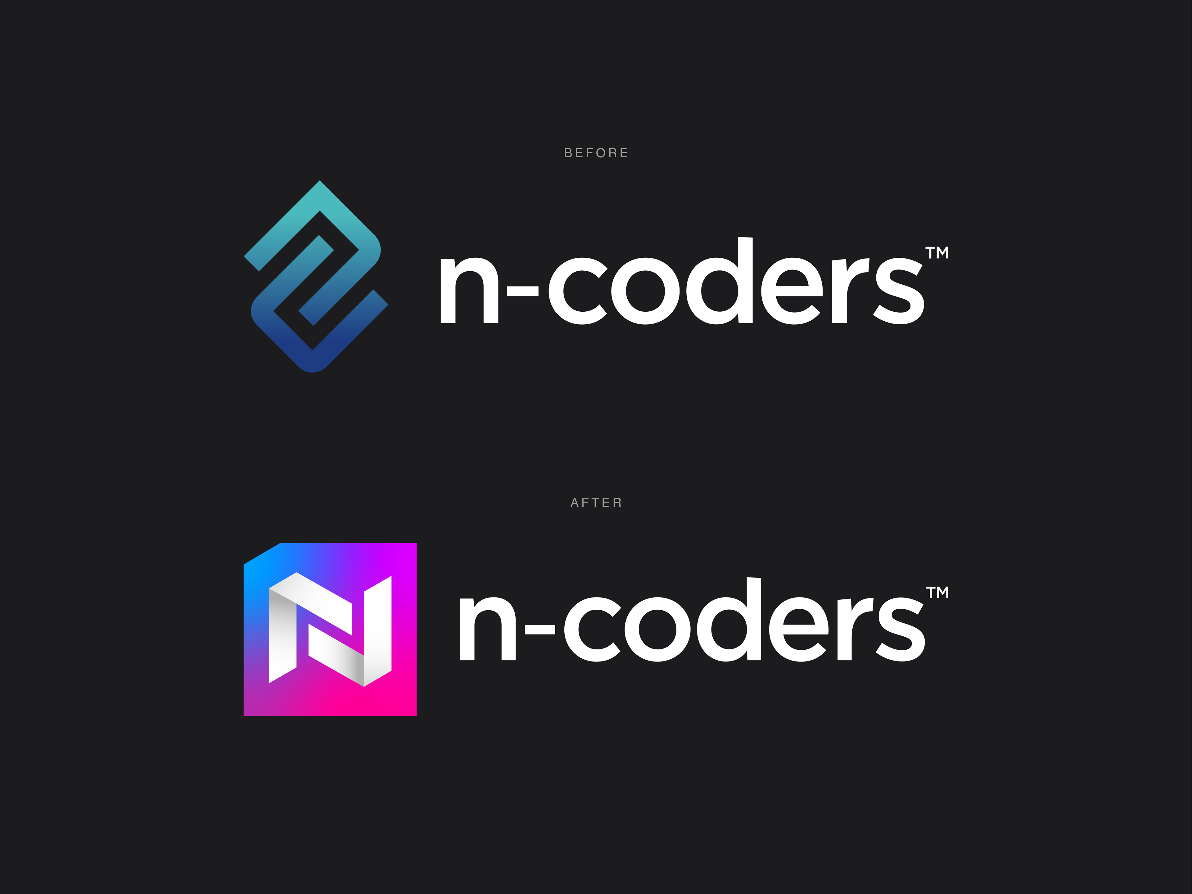
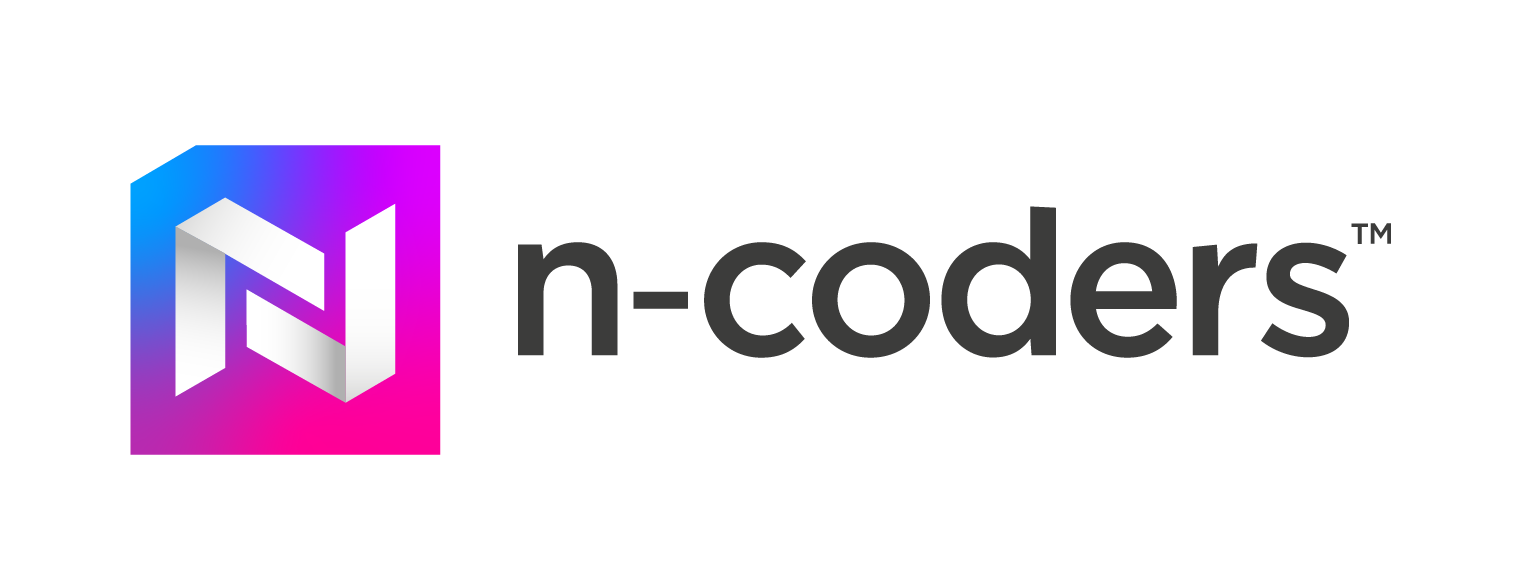
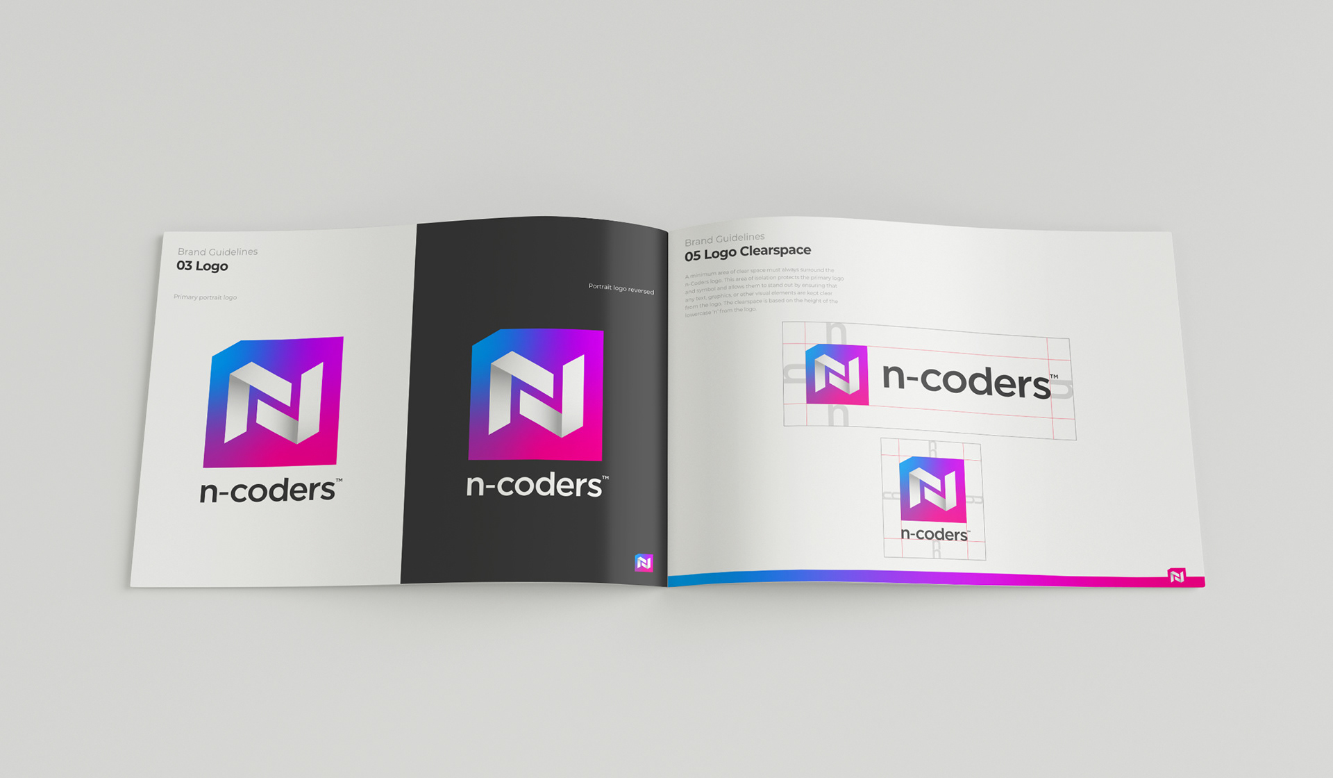
The logo concept came from the same thinking — it needed to earn its place. After exploring a range of directions, I landed on two coding brackets < > interlinking to form the letter N. It's a clean, confident mark that rewards a closer look: most people read it as a bold geometric letterform first, then clock the brackets — a detail that consistently sparked conversation with the n-coders team and their clients. The outer container shape references a floppy disk or save icon, quietly anchoring the mark in the company's technology roots without being heavy-handed about it.
Three logo variations were developed to give the brand full flexibility across all touchpoints, from business cards to digital platforms.
The Deliverables
- Full brand identity - primary, horizontal, and icon logo variations
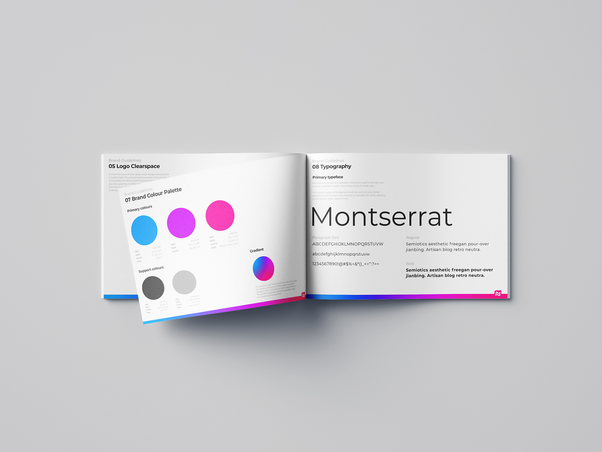
- Full Brand Guidelines built from scratch - vibrant colour palette, logo usage rules & typography system
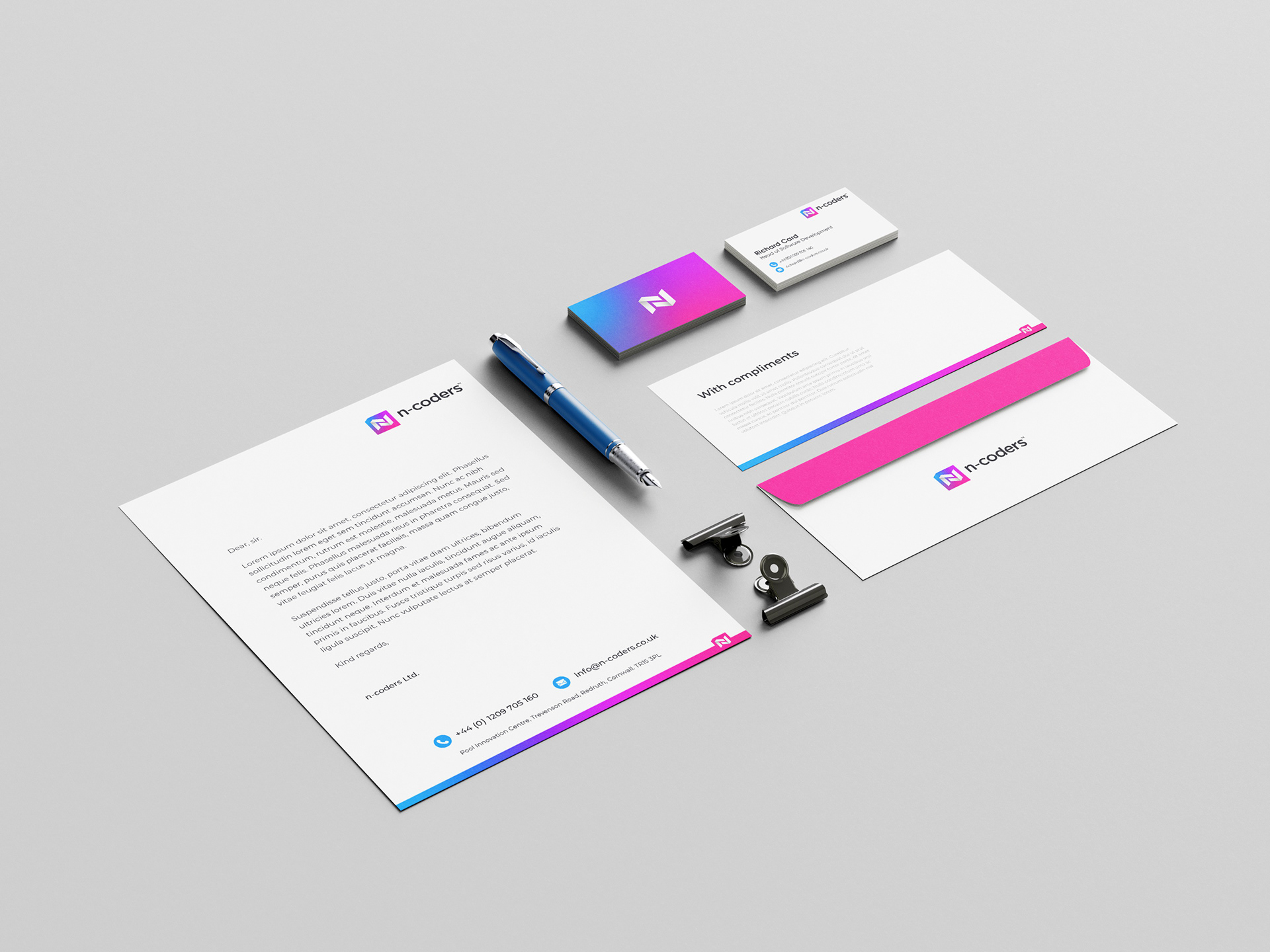
- Stationery suite - letterhead, business cards, compliments slip, and envelope
- Social media graphics suite
- Art direction for the n-coders website
The Outcome
The rebrand launched in April 2022 to an overwhelmingly positive response from both the n-coders team and their wider client base. The energy of the new identity was immediately noticed, and the bracket-forming-N concept regularly sparked conversation, with many people enjoying the moment of recognition as the coding reference revealed itself. The brand gave n-coders a visual presence that finally matched the ambition of their work.